
Author: Yogesh Kumar Singh
What is Tableau?
Tableau is the industry’s most widely used business intelligence (BI) tool for data visualization, helping organizations understand their data and make better business decisions.
What is a Butterfly chart?
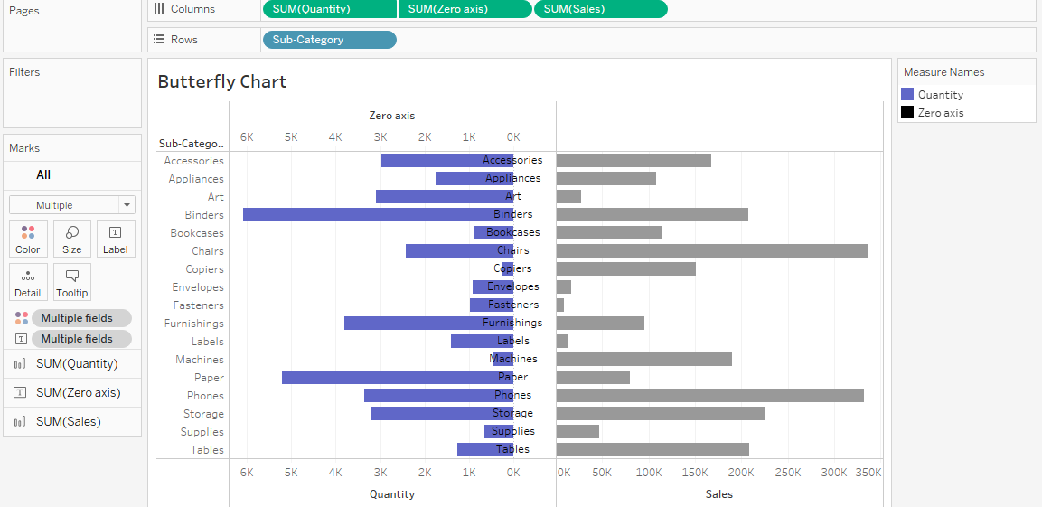
A butterfly chart is a type of data visualization that displays two sets of data in a single chart. The graph is made up of two mirrored bar charts that are attached by a central axis. The bars on either side of the axis represent positive and negative values, and the axis itself represents a value of zero.
Butterfly charts are useful for comparing two measures, highlighting differences between them, and displaying changes over time.
There are many custom charts we can make in Tableau that are not available by default, one of which is the Butterfly chart.
Let’s see how it is done.
Step 1: Open Tableau.
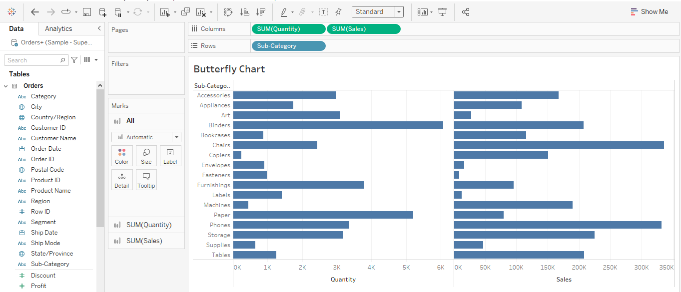
For this demonstration I am using the sample superstore data set. I constructed a bar chart using the common dimension “sub-category” and the necessary measures, Quantity, and Sales onto the worksheet.
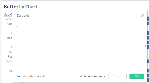
Step 2: Create a zero-axis calculated field.
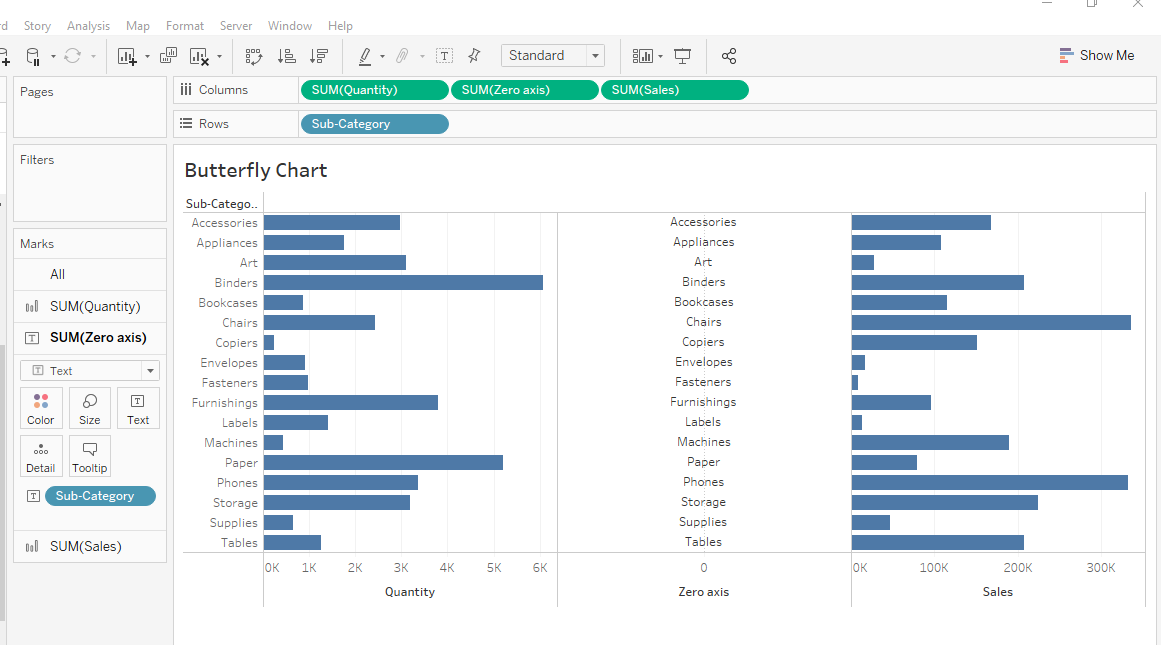
Add the Zero Axis to the worksheet and convert its mark type as text. Add sub-category to Rows.
Step 3: Reverse one of the bar charts.
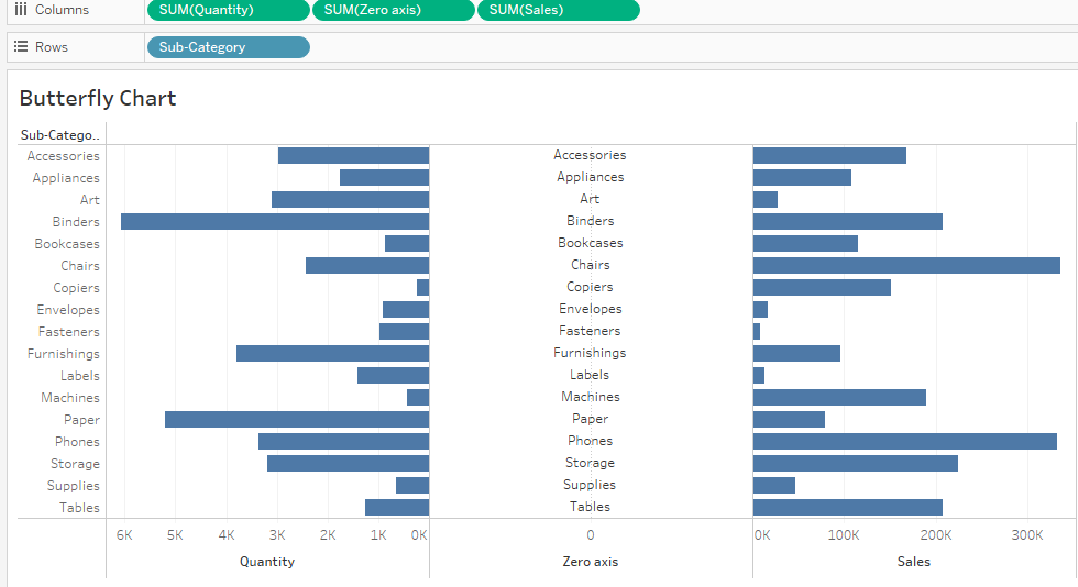
Right-click on the axis at the bottom and select edit axis. select the ‘Reversed’ option, this will reverse the bar chart.
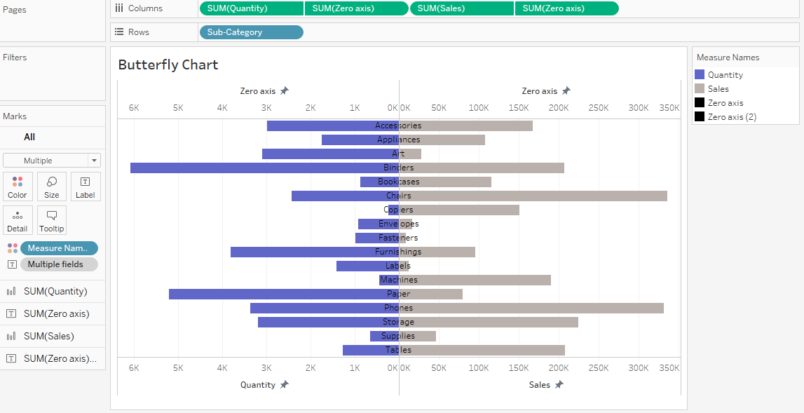
Step 4: Create a ‘Dual Axis’ using the Zero Axis and Quantity pills. Synchronize the zero axis.
Step 5: Replicate zero axis measure.
Repeat the above steps for Sales.
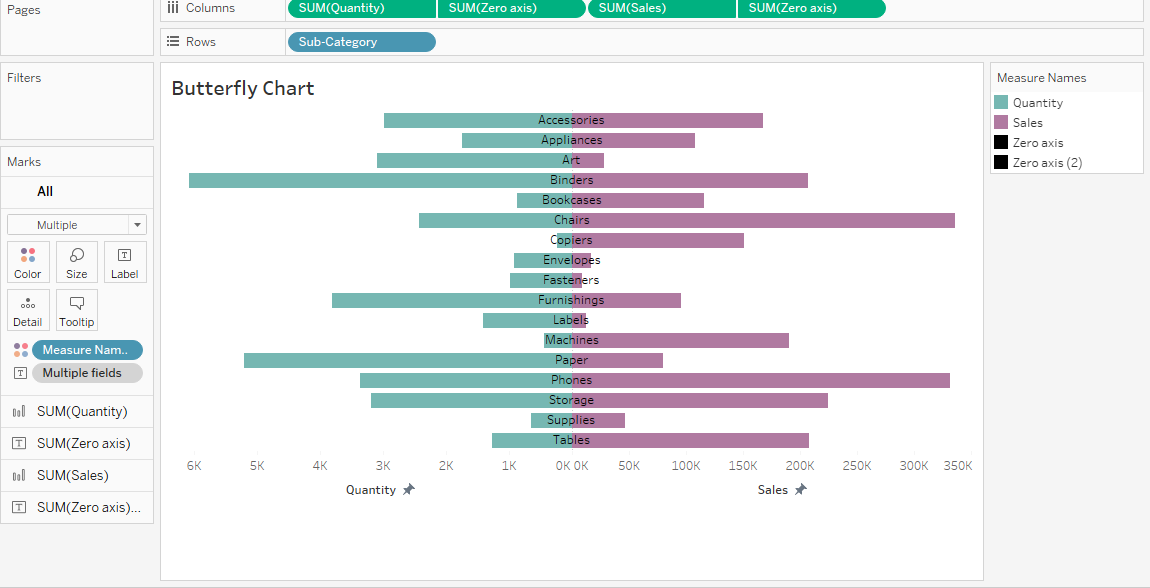
Step 6: Change the color and remove the header based on your preferences.
Conclusion
Custom charts are really effective since it creates a lot of creativity in visualization. When it comes to Butterfly charts they can be useful to visually compare two measures easily.


